
For over a decade I led UX, mobile, web, and interactive design at Giant Interactive — a full-service digital studio working with Apple, Google, CBS, HBO, Disney, Warner Brothers, 20th Century Fox, MTV, and Nickelodeon. The most significant project of that era: designing and product-managing a secure online screening platform and companion iOS and tvOS apps for the Academy of Motion Picture Arts and Sciences.
What started as a proof of concept for short films became the foundational infrastructure the Academy still runs today.
The Problem
For most of its history, the Academy distributed screeners on physical DVDs — mailed to thousands of voting members across the country. The problems were significant: logistics and cost of physical production and distribution, no viewership tracking, no way to know whether a member had actually watched a film before voting, and a serious security exposure.
Screener leaks were a top concern — not abstractly, but as a real and recurring threat to the awards-season economics of every studio submitting films. A physical disc, once in someone's hands, could be copied. The Academy needed a solution that closed that risk permanently, while also modernizing an experience that had fallen far behind what members expected from streaming in 2017.
The Security Challenge
The central design challenge wasn't visual — it was architectural. How do you build a streaming platform secure enough for the Academy's requirements without making it feel like a security checkpoint for members ranging from emerging filmmakers to 80-year-old Hollywood legends?
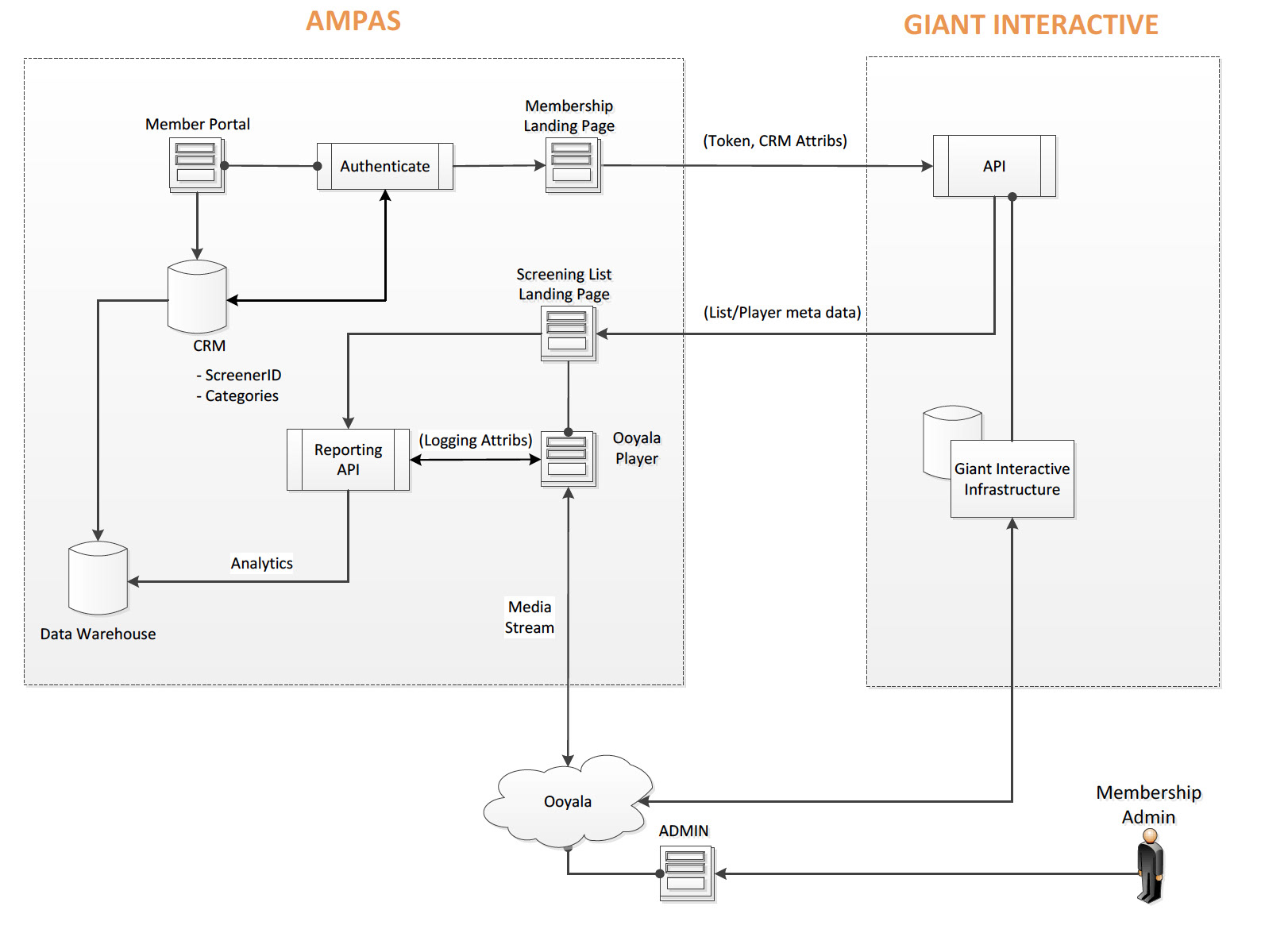
The answer was to solve security at the infrastructure level so the UX could remain completely clean at the surface. Every stream was digitally watermarked to the individual viewer — a significant expense, but a non-negotiable one. If a film leaked, the Academy could trace it to a specific member. That capability changed the threat model entirely: the deterrent was built into the content itself, not into friction layered onto the experience. Members didn't encounter security — they simply watched films.
I was involved in defining and product-managing the technical architecture alongside engineers far more qualified to build it. My role was to ensure the security requirements and the experience requirements were solved together, not traded off against each other.
Design Approach
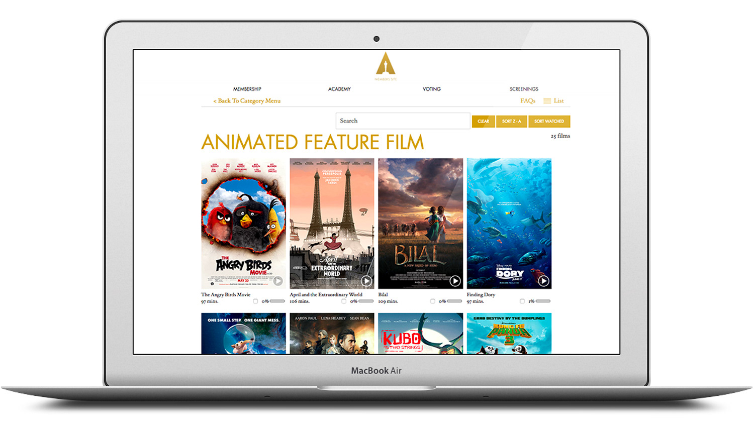
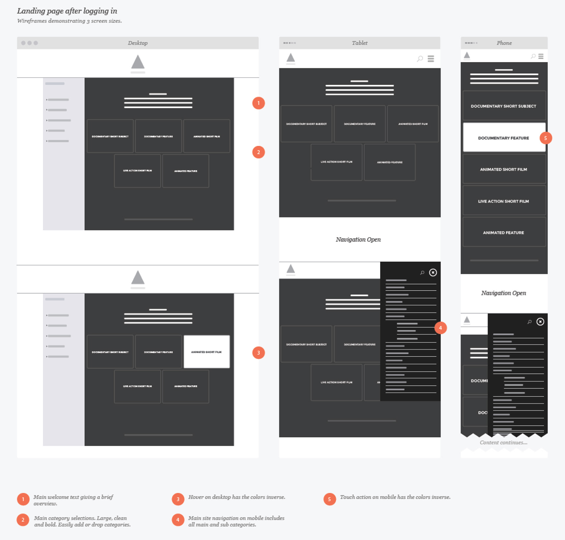
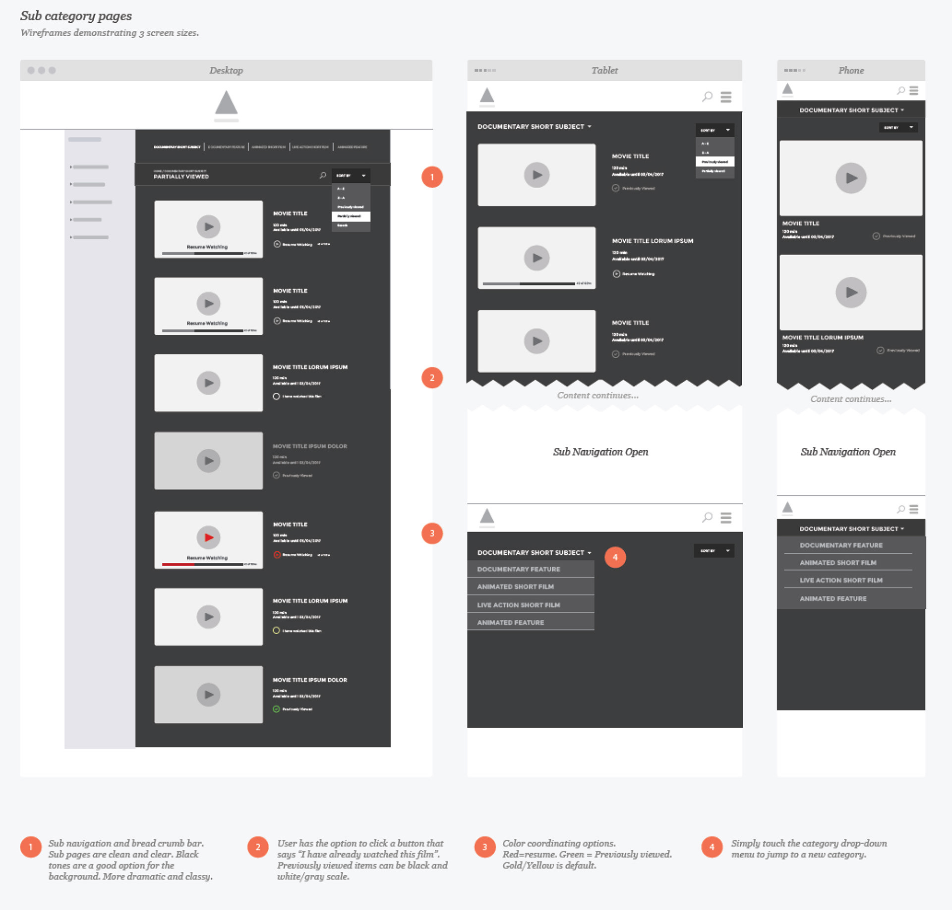
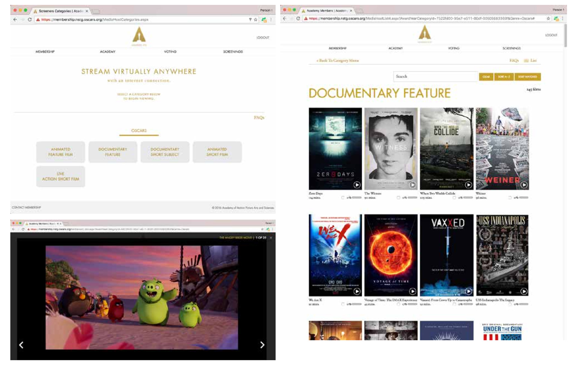
The design had to feel immediately familiar. Academy members weren't going to read instructions — the platform needed to work the way they already expected streaming to work, while handling the specific behaviors the screener context required: browsing a curated catalog of submitted films, tracking what had been watched, and moving between devices without friction.
With membership spanning generations, simplicity wasn't a nice-to-have. Large, high-contrast touch targets, clear information hierarchy, and an interface that made no assumptions about technical fluency were baseline requirements. The visual language was cinematic and clean — befitting an organization whose entire purpose is the celebration of film.
Lean-Back as the Primary Use Case
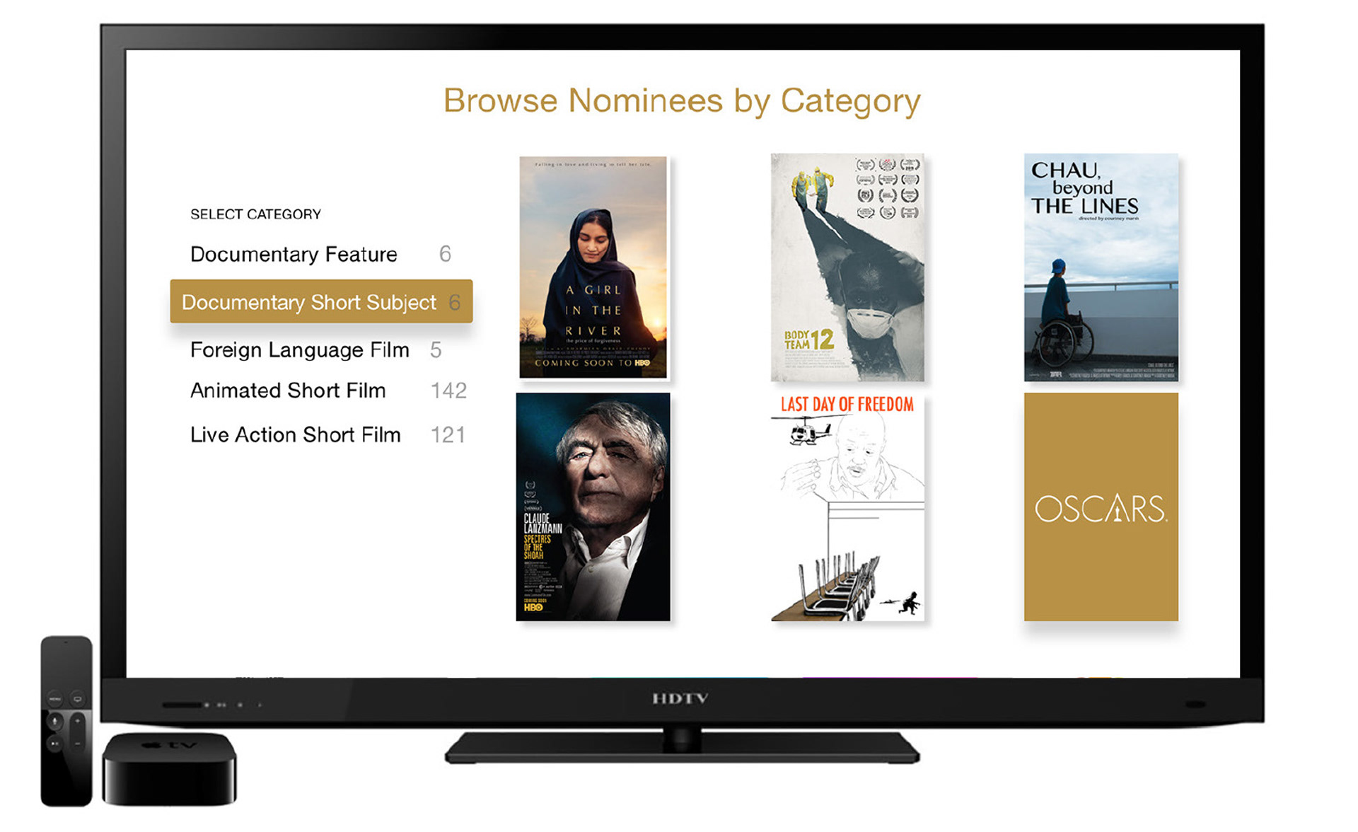
Watching a screener is fundamentally a living room experience. Academy members aren't reviewing films on a laptop — they're watching them the same way they watch everything else: on a television, from a couch, with a remote. Lean-back was the primary use case from day one, which shaped every design decision about navigation, content hierarchy, and interaction model.
The tvOS app was built for this — optimized for Apple TV, with a Roku version extending reach to members across devices. The iOS app served the secondary use case: on-the-go viewing for members who wanted to catch up on shorter films while traveling during awards season. Consistent design language across all surfaces meant the experience transferred between devices without reorientation.
Final Product
We launched the platform in 2016 as a proof of concept covering the short film categories — a manageable scope that let us validate the security model, the viewing experience, and the operational infrastructure before expanding. A few hundred members. A handful of categories. Closely monitored.
It worked. Over the following two years, the platform expanded across categories, and its reach grew to encompass the full Academy membership. After my departure from Giant Interactive, the platform continued to mature — and the foundational architecture and design concepts we built continue to run the Academy's screener program to this day, now covering every category across all Oscar voting cycles.
Other Notable Work at Giant Interactive
During my twelve years at Giant, I led UX and design for projects across the entertainment industry — HBO, Disney, CBS, Apple, Google, MTV, Nickelodeon, Warner Brothers, and 20th Century Fox among them. The work spanned digital campaign experiences, content discovery platforms, interactive marketing, streaming UX, and mobile product design. The Oscar platform was the capstone, but it was built on a decade of design leadership across some of the most demanding clients in the industry.