Sling TV disrupted traditional cable by offering live TV over streaming — but early UX decisions blurred the line between live, on-demand, and transactional content, creating confusion, friction, and churn. I led a comprehensive UX strategy and redesign to re-center Sling TV around a clear, best-in-class Live TV experience, grounded in customer behavior, usability research, and platform data.
Business & Customer Problem
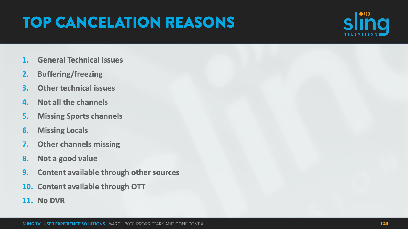
Sling TV faced a structural UX challenge that went deeper than visual design. Customers came expecting traditional TV behaviors — channel surfing, a grid guide, DVR — and found an interface that increasingly resembled a streaming on-demand library. Live, on-demand, and transactional content were visually and architecturally indistinct. Cancellation data pointed consistently to usability, missing DVR functionality, and unclear value perception.
The core insight was simple and significant: Sling TV was a live TV service without a clearly defined live TV experience. The product had drifted toward the wrong reference point — competing with Netflix on Netflix's terms, rather than owning the live TV space it had created.
UX Strategy & Approach
1. Re-Anchor the Product Around Live TV
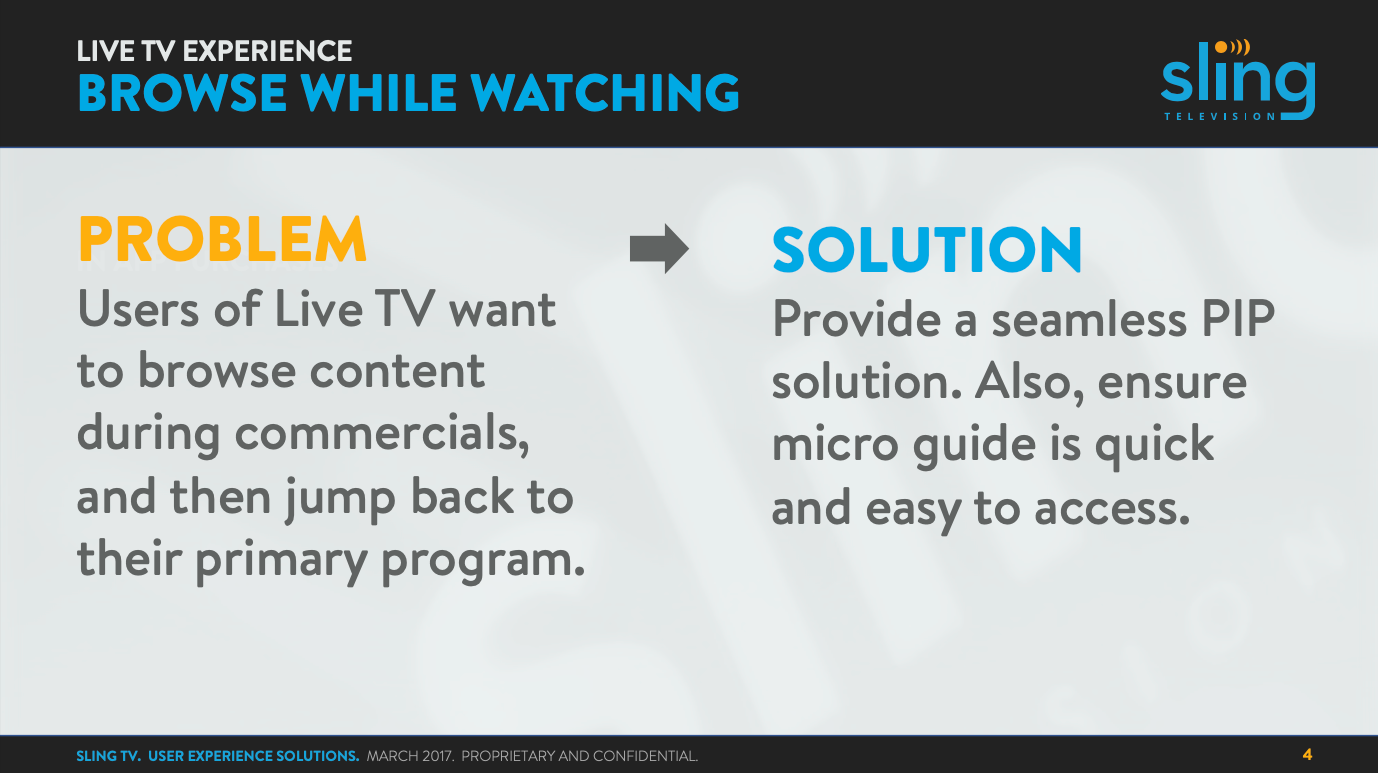
Customer data showed viewers watched a small, consistent set of channels — 5.9 per week on average. That pattern isn't accidental; it reflects deeply habitual behavior that live TV has always supported. Channel surfing, last-watched recall, time-based guides — these aren't legacy features to be replaced. They're the interaction model that makes live TV feel like live TV.
We reintroduced and modernized these behaviors: browse-while-watching via Picture-in-Picture, last five channels recall, directional channel surfing, a time-based grid guide, and a persistent clock for temporal orientation. The goal was to reduce cognitive load by aligning with mental models viewers already had — meeting them where they were rather than asking them to relearn TV.
2. Clarify Content Types & User Intent
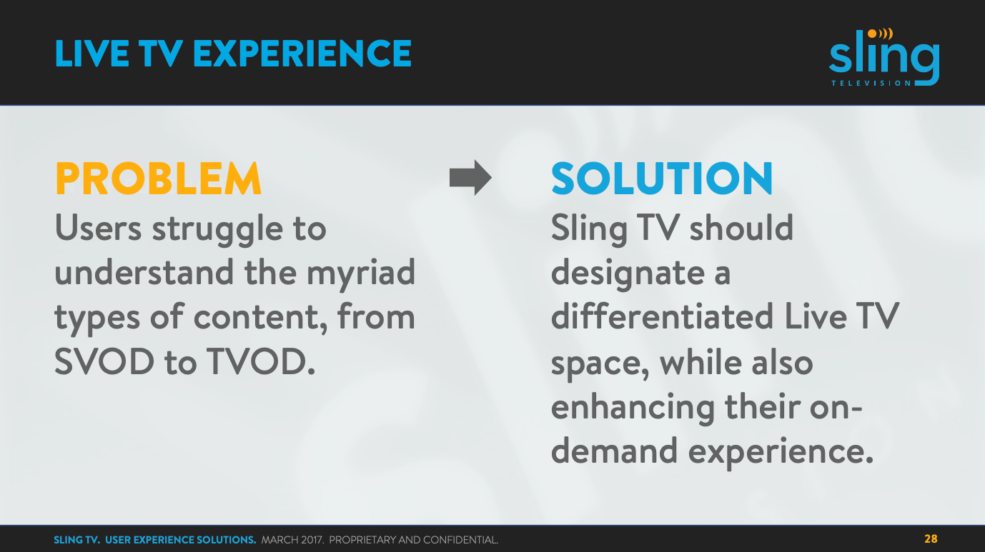
Users couldn't reliably distinguish between Live TV, On-Demand, and Transactional content — and that ambiguity eroded trust in the service. If you can't tell whether something is live or recorded, available or locked, included or paid, the experience feels unreliable even when the content is there.
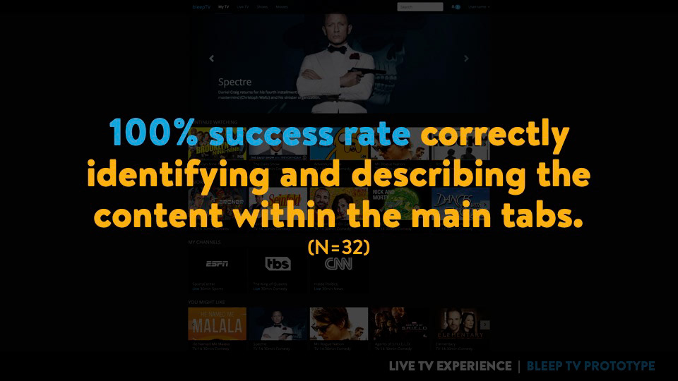
We proposed a distinct Live TV destination, content organized by user intent rather than internal taxonomy, and clear visual and navigational separation between content modes. Usability testing validated the approach directly: 100% task success in identifying content types and finding what was airing live, across 32 participants. That's not a marginal improvement — it's a baseline that had been missing.
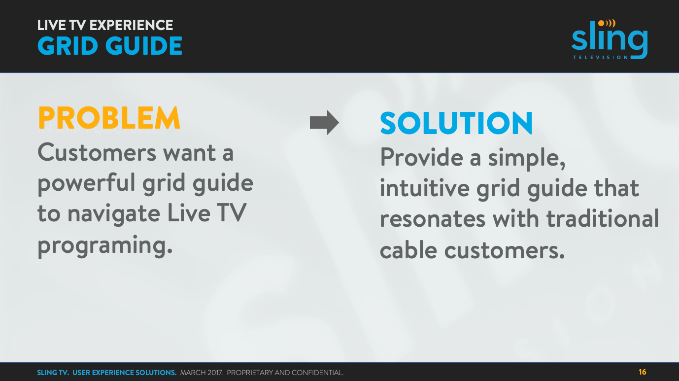
3. Blend Familiar Navigation with Modern Discovery
The risk in modernizing a TV interface is alienating viewers who've spent decades building habits around a grid. The risk in not modernizing is a product that feels dated and fails to surface the content people actually want. We threaded that needle with a hybrid model: grid-based navigation for predictability alongside analytics-driven content ribbons that adapt to viewing behavior, smart watchlists for continuity, and elevated search as a first-class navigation entry point.
The principle was that comfort and discovery aren't in tension — they operate on different timescales. Familiar structure gives viewers confidence on day one; behavioral personalization makes the experience better over time.
4. Treat Monetization as a UX Problem
Revenue features layered on top of an experience feel like interruptions. Revenue features integrated into an experience feel like value. The distinction is a design problem, not a business one.
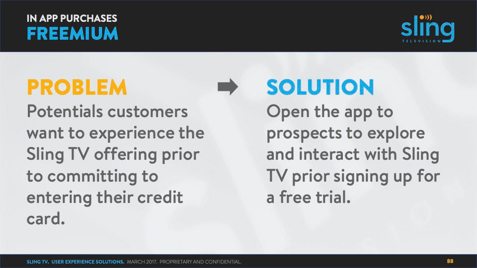
We integrated monetization into the natural viewing flow: freemium access for prospects, contextual upsells surfaced at the moment content becomes relevant rather than at checkout, simple one-click Extras management, and DVR streamlined through favoriting at both the series and episode level. The measure of success wasn't conversion rate in isolation — it was whether the upsell felt like a helpful recommendation or an obstacle.
Outcomes & Impact
The work delivered strong research validation and strategic alignment across the organization:
- 100% task success in Live TV discovery and content-type identification testing (N=32)
- Qualitative feedback that landed exactly where it needed to: "It's just like flipping channels." / "This feels more like TV than most streaming services."
- A UX roadmap directly mapped to the top churn drivers identified in customer research
- A scalable experience framework built to absorb future platform growth
What I'd Do Differently Today
If I were leading this work now, I would push harder on personalization earlier — using real-time behavioral signals to adapt Live TV surfaces dynamically rather than treating personalization as a later-phase feature. I'd invest sooner in performance and reliability UX, since buffering and technical instability were top churn drivers that design can address more directly than it usually does. I'd design cross-device first from the start, accounting for mobile-to-TV handoff patterns that were already becoming central to how people watch. And I'd more explicitly connect every UX decision to subscription lifecycle metrics — from trial activation through retention — so the design rationale was legible in business terms from day one.