
Every era of video technology has arrived with a different set of promises — and a different set of design problems. LaserDisc promised the first serious home cinema experience. DVD promised interactivity. Broadband promised everything, anywhere. Streaming delivered. Mobile changed it again.
From 1993 to 2018, I worked at the leading edge of each of these transitions — not as a spectator, but as the person responsible for figuring out what the new medium actually meant for the experience of watching, discovering, and engaging with video content. This is that arc.
Era I — The Criterion Collection (1993–2001)
I joined The Criterion Collection in 1993 as Director of Development, running both design and technology initiatives for one of the most respected film labels in the world. Criterion's mandate — to release definitive editions of important cinema — meant that every title was also a design and technology problem: how do you honor a filmmaker's work while pushing the limits of what the disc format can actually do?
LaserDisc was the canvas when I started. It was a format that rewarded ambition — large enough to contain director's cuts, commentaries, and supplementary materials that had never been possible in the theatrical or VHS experience. My job was to make those possibilities feel cohesive and intentional, not like a pile of extras bolted onto the film.
Then came DVD. The format shift wasn't just technical — it changed what audiences expected and what studios were willing to invest. For the first time, interactivity was a genuine design space: branching menus, chapter navigation, supplemental content that could be woven into the viewing experience rather than appended to it. I was deeply involved in Criterion's approach to that transition, helping define the design language and interactive architecture that would distinguish Criterion releases from the commodity DVD market forming around them.
Over eight years I worked on dozens of titles — Brazil, This Is Spinal Tap, Pulp Fiction, The Rock, and many more. Each one was its own brief: different filmmaker relationships, different archival material, different technical constraints, different stories to tell. The common thread was a belief that the disc experience should be as considered as the film itself.

Beastie Boys Video Anthology
The capstone of my time at Criterion was the Beastie Boys Video Anthology — released on October 10, 2000 as Criterion's 100th DVD title, and their first and only music video compilation. It remains one of the most technically ambitious things I've worked on.
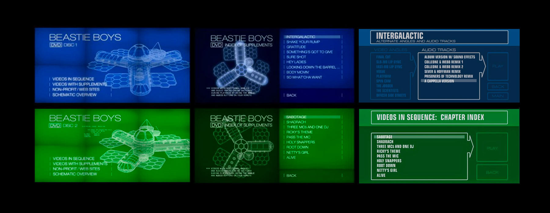
Eighteen music videos. Most of them with multiple alternate camera angles and audio tracks. Hundreds of possible image and sound combinations — new surround mixes, a cappella versions, instrumentals, more than forty remixes. The interactive menu system I designed was the mechanism through which a viewer could explore all of it: choosing angles, switching audio tracks, navigating across eighteen videos without losing the thread of the experience.
Adam Yauch — MCA — called me the Re-Animator for that work. I've never had a better job title.
The release was certified Gold in the US and double Platinum in Canada. But the achievement I'm proudest of is more modest: the interface worked. Something that complicated — that many branching combinations — felt navigable and even playful. That's harder than it sounds.

Era II — Giant Interactive: Platform Era (2005–2017)
By the time I joined Giant Interactive in 2005, physical media was no longer the frontier. The internet had changed everything about how video was distributed and consumed — and the design problems had changed with it. The challenge shifted from "how do you design the best possible disc experience" to "how do you design across every screen, every platform, every network condition, and every user expectation simultaneously."
Giant was a full-service digital studio working with some of the most demanding clients in the industry: Apple, HBO, Disney, CBS, Google, MTV, Nickelodeon, Warner Brothers, 20th Century Fox. The twelve years I spent there were a crash course in platform design at scale — building systems rather than objects, designing for distribution rather than for a single, controlled experience.
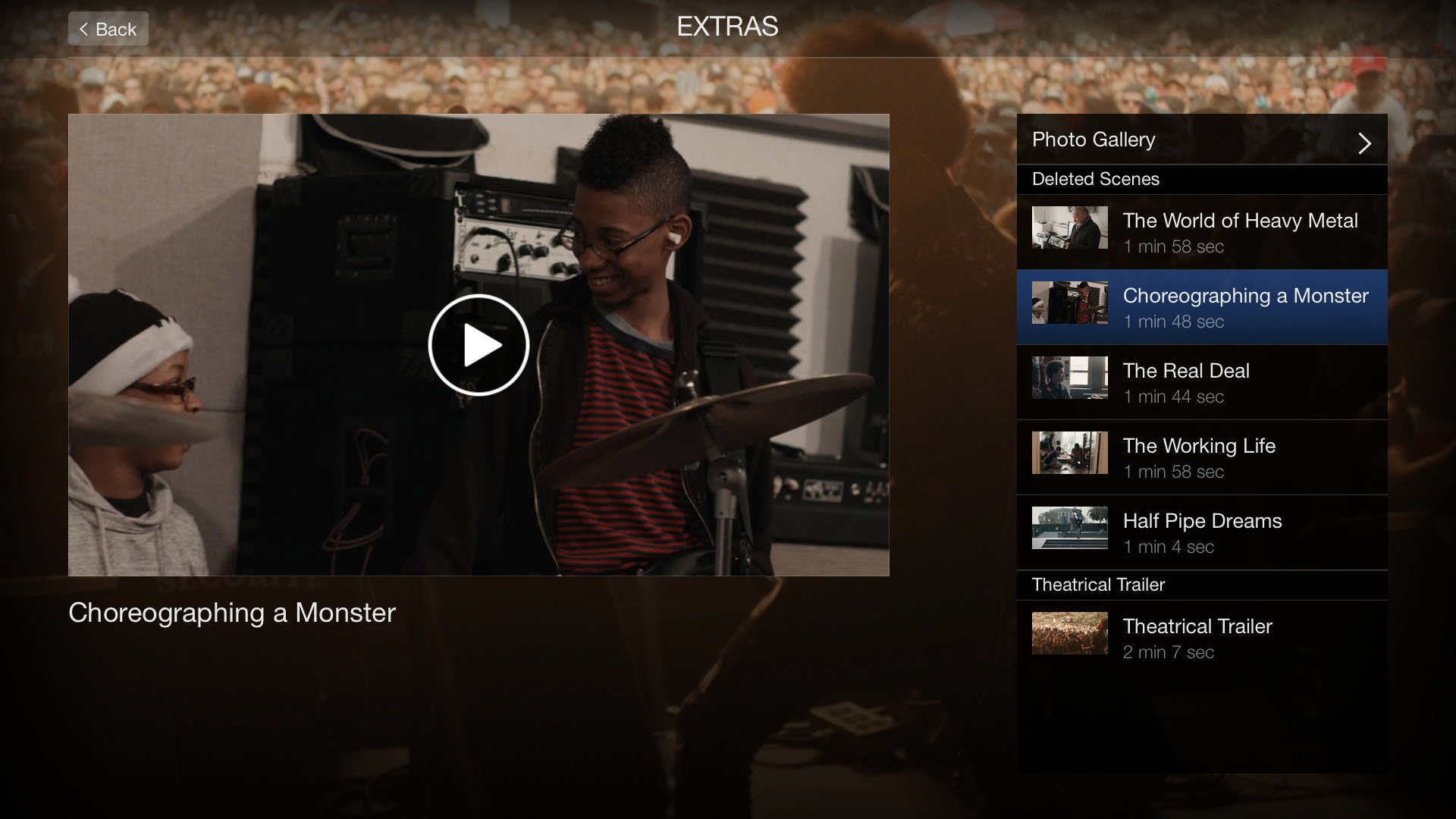
iTunes Extras
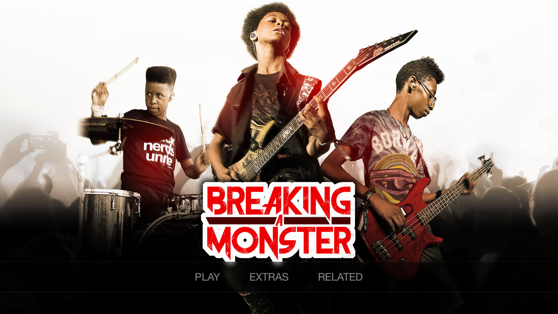
One of the earliest and most consequential projects of the Giant era was positioning the studio as a preferred partner for iTunes Extras — Apple's format for delivering supplemental content alongside digital film purchases.
Apple was extraordinarily selective. There were only seven preferred vendors in North America. Getting there required extensive testing, technical validation, and design review against Apple's exacting standards — the kind of process that reveals exactly where your quality threshold actually sits versus where you think it sits.
Once approved, I designed dozens of Extras titles personally and built the processes and design systems that would let the team deliver hundreds more at the same level of quality and consistency. This was Criterion training applied to a new medium: the format was different, the platform was different, but the belief that supplemental content deserved the same care as the primary experience was the same.
OTT Platforms
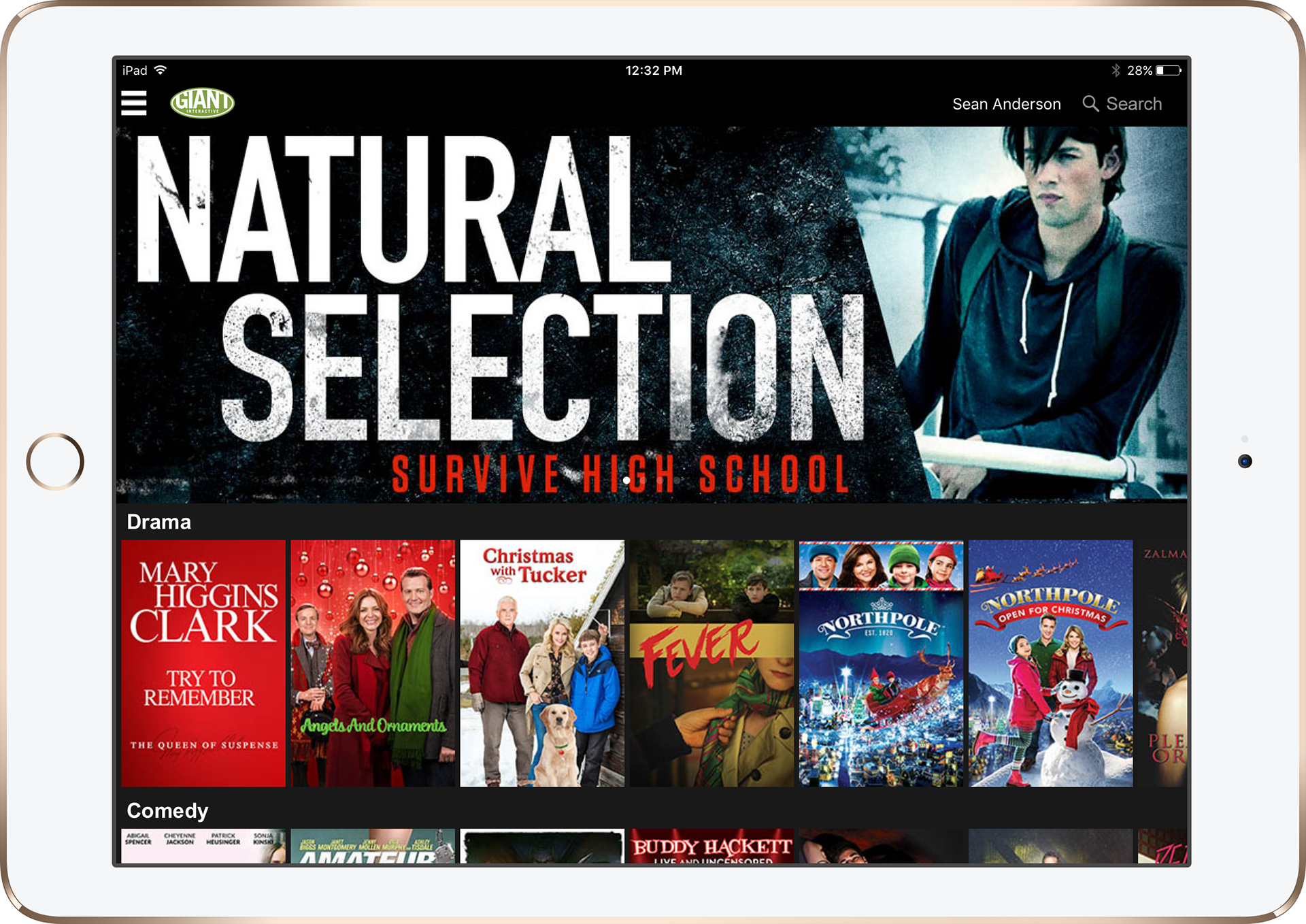
The years between 2010 and 2015 were the years streaming became real — not a niche for early adopters but an expectation. Giant built and shipped a range of OTT platforms during this period, and I served as product manager and design lead across them.
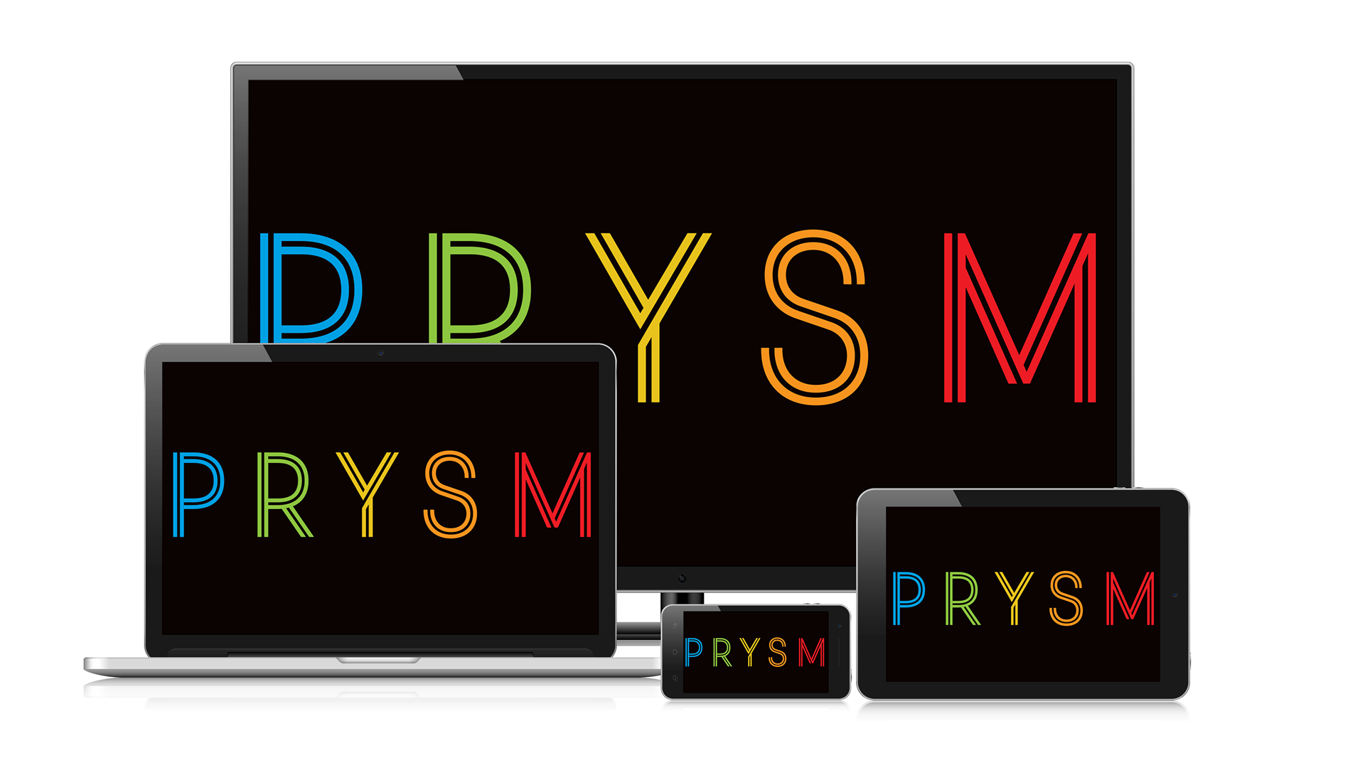
Prysm was Giant's own multi-platform cloud-based OTT service — built to allow content owners to extend their reach across desktop, iOS, Android, Apple TV, and Roku through a single managed platform. My role was product management: working cross-functionally with design, engineering, marketing, and executive teams to bring the service to multiple customers.
Renderyard was a film network for filmmakers — a platform for discovering and watching independent short films and documentaries from around the world, with an embedded online film festival. I designed and led development of iOS apps and a Roku channel, all running off a custom CMS built for video distribution through a global CDN.
Melody Entertainment
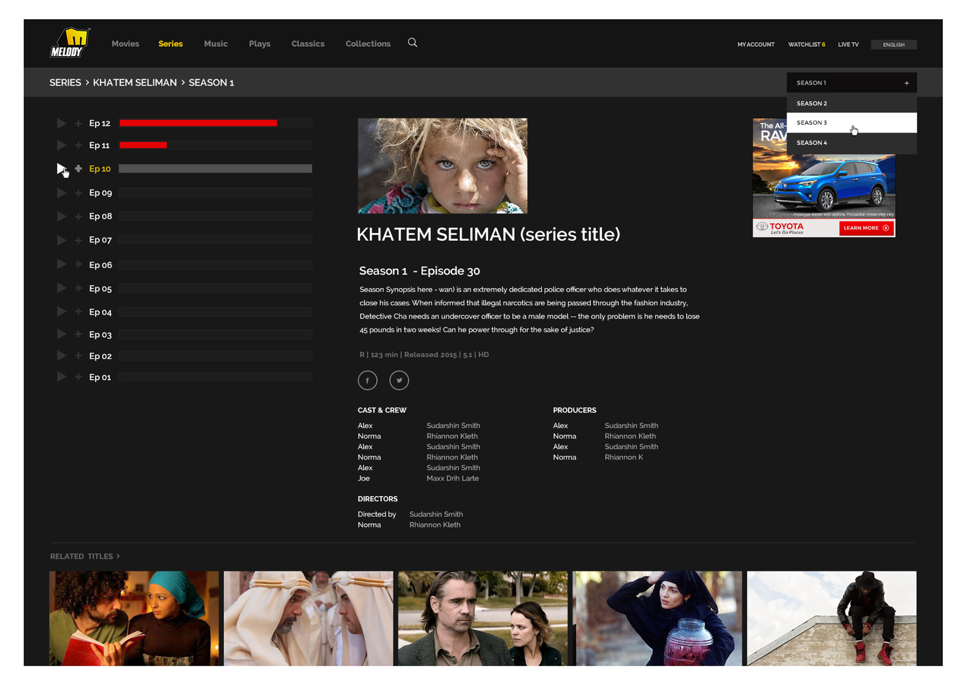
Melody brought a different challenge in scale. A fully integrated entertainment company with over 1,500 hours of programming — 700+ feature films, 50+ television programs — and a YouTube presence of 6.1 million subscribers and 1.8 billion views. Building a video delivery platform to distribute that catalog globally across web, Apple TV, Roku, and Android TV meant designing for international audiences and a library that dwarfed anything I'd worked with on a single disc.
Indiekid Films
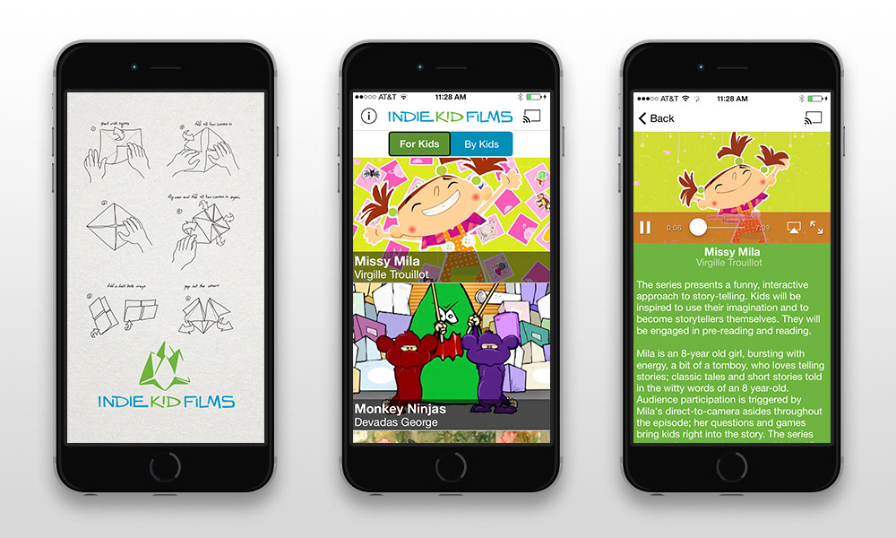
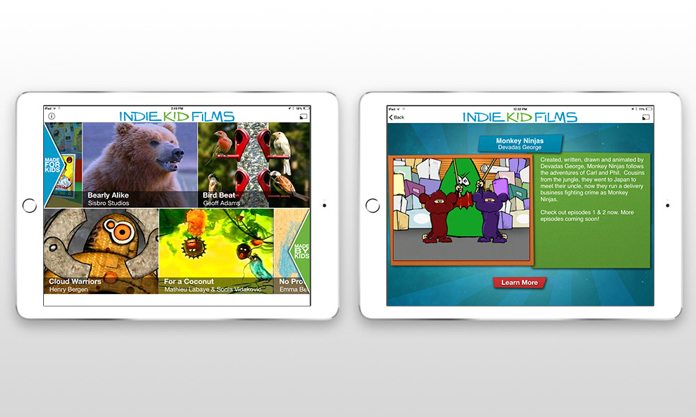
Indiekid Films was a portable film festival for children — a curated, evolving collection of short films designed for young audiences. As technical and creative lead I delivered iOS apps, a website, and a Roku channel from a single content model. The design challenge was particular: young audiences have very different expectations for navigation and discovery than adults, and the app had to work for kids browsing independently as easily as for a parent choosing something to watch together.
Guitar World Lessons
Guitar World Lessons tackled a problem that still trips up platforms today: cross-platform video commerce. The client wanted users to be able to purchase guitar lessons on iOS or web and access those purchases seamlessly from any other platform — requiring a content delivery backend, cross-platform authentication, and integration with multiple payment rails (iTunes and Authorize.net) simultaneously.
As product manager and lead designer I owned the architecture end-to-end: the UX across surfaces, the backend design, and the payment integration. The goal was an experience that felt as simple as buying a song while doing something considerably more complex underneath.

Appic
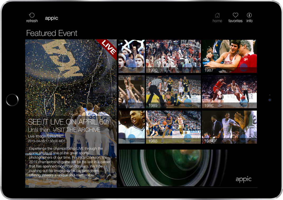
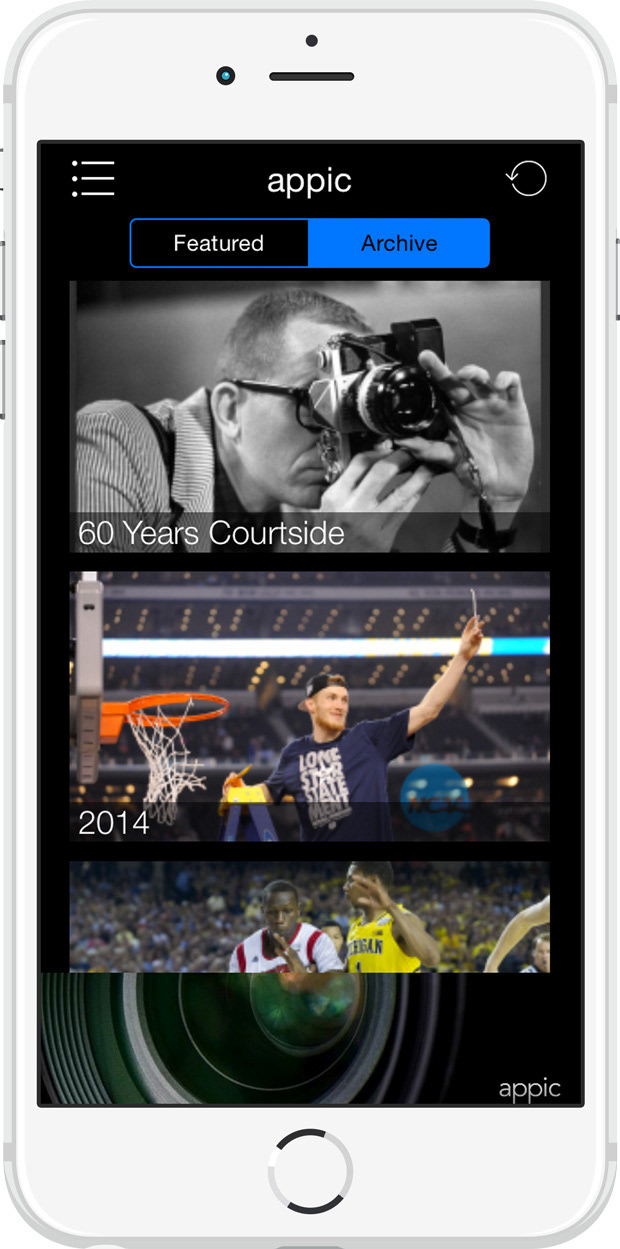
Appic was a second-screen iOS app designed for live events — delivering real-time professional photography from sports, concerts, and news events directly to a viewer's phone while the event was happening. As product manager and UI/UX designer, the challenge was timing and relevance: content that's compelling in the moment of an event is very different from content designed to be browsed later. The interface had to make freshness and recency legible at a glance.
Film Digital Marketing
Alongside the platform work, Giant handled digital campaigns for major film releases — a different mode of video work, but one that demanded the same discipline about how audiences engage with content on screens.
Rich media banner campaigns for Despicable Me 2's Real D release (DoubleClick, Point Roll, page takeovers). Promotional sites for Roadside Attractions' Thanks For Sharing and Redemption, designed to carry the film's story from pre-release through theatrical and home video windows. Four years and twelve auction sites for Project Runway — Seasons 12 through 15, all franchises — where I was product manager, creative lead, and technical lead on the e-commerce backend.
The scale of this work was significant: one design concept could generate hundreds of deliverables across formats and sizes. The discipline it built — designing systems that could be executed at volume without losing quality — applied directly to everything else I was building on the platform side.

Era III — The Academy's Oscar Screening Platform
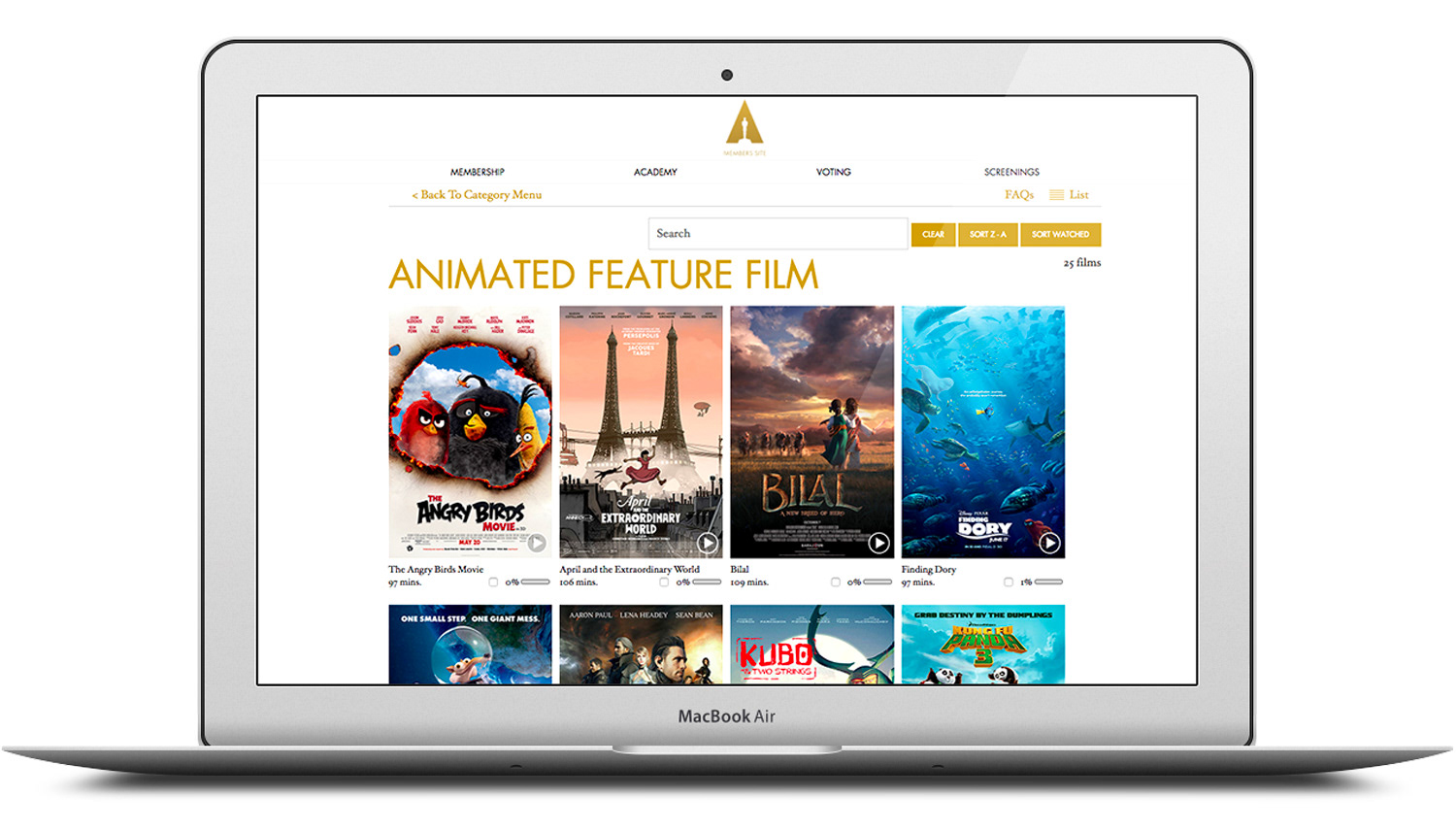
The capstone project of the Giant era was designing and product-managing a secure streaming platform and companion iOS/tvOS apps for the Academy of Motion Picture Arts and Sciences — a project that began as a proof of concept in 2016 and became the infrastructure the Academy still runs today.
Era IV — Sling TV
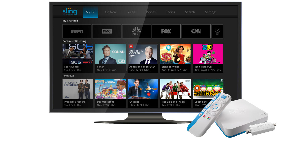
After Giant, I moved into the streaming-native era — designing for a product built entirely around live television over the internet, at consumer scale.
"Twenty-five years. LaserDisc to livestream. The technology changed completely, more than once. The question never did: what does watching feel like, and how do you make it better?"